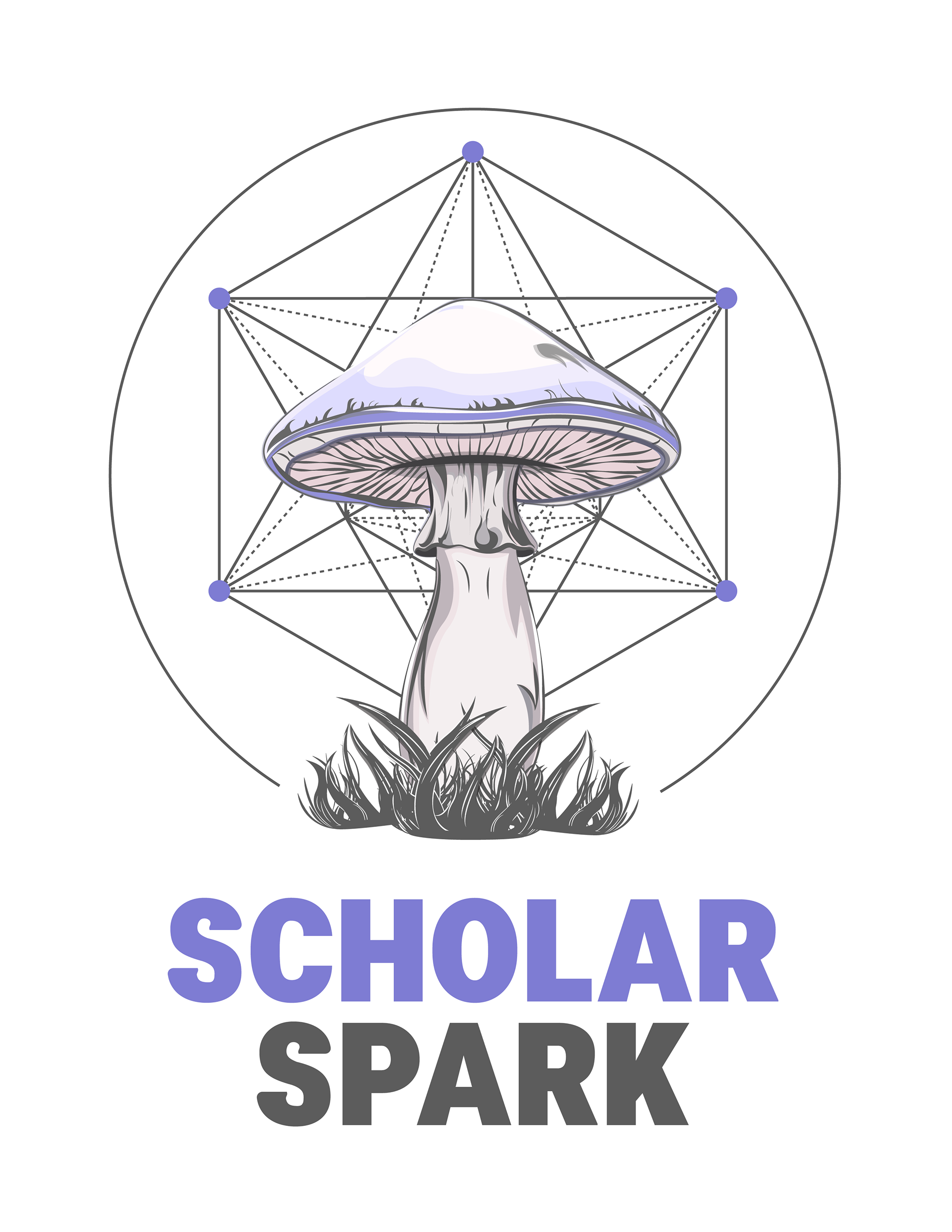


The Metatron’s Cube and the mushroom are the heart of our brand: symbols of interconnection, growth, and transformative research.
For clarity and impact, the logo is best used as a standalone mark, free from the wordmark. This emphasizes its geometric harmony and organic inspiration while keeping our identity open, modern, and adaptable.

Scholar Spark Symbol Color Limitations
The Scholar Spark symbol has specific color limitations in its brand identity system:
Unlike many organizations, Scholar Spark does not maintain black or white monochrome versions of its symbol. Instead, the brand relies exclusively on its primary colored version and a specially designed monochrome version. This limitation is intentional to preserve the distinctive visual identity of Scholar Spark across all applications.
primary colored version


monochrome version

Importance of Monochrome Symbol Versions
A grey version of a symbol serves several critical purposes in brand identity systems:
• Versatility in Applications: Monochrome logos provide flexibility when full-color versions cannot be used due to technical limitations, background conflicts, or design constraints.
• Visual Consistency: Monochrome versions maintain brand recognition while adapting to environments where color might be distracting or inappropriate.
• Print Considerations: For documents printed in grayscale or black and white, a properly designed monochrome logo ensures optimal visibility and recognition.
• Accessibility: Monochrome versions can improve readability for users with certain visual impairments or when displayed on screens with limited color capabilities.
• Professional Appearance: In formal or subdued contexts, monochrome logos often convey sophistication and professionalism.
Rules for Using Monochrome Symbol Versions
When implementing monochrome symbol versions, these guidelines should be followed:
• Use the monochrome version only when the full-color symbol cannot be appropriately displayed.
• Maintain proper contrast with backgrounds to ensure visibility.
• Preserve the exact proportions and spacing of the original symbol.
• Never alter the designated monochrome values or create unauthorized variations.
• Follow brand guidelines regarding minimum size and clear space requirements.


When applications would typically call for black or white versions, the monochrome Scholar Spark symbol should be used instead, with careful attention to contrast and visibility. This approach ensures brand consistency while still providing necessary flexibility for various media and contexts.

Wordmark Usage Guidelines

Wordmark Usage
The Scholar Spark wordmark (the text-only version of the logo without the symbol) serves as an important alternative presentation of the brand identity:
• Standalone Applications: The wordmark can be used independently when the full logo with symbol might be too complex or when space constraints exist.
• Secondary Brand Elements: In materials where the full logo has already established brand presence, the wordmark can be used for reinforcement without redundancy.
• Text-Heavy Contexts: In documents, presentations, or interfaces where visual simplicity is preferred, the wordmark provides clear brand identification without competing with content.
• Small-Scale Applications: When reproduction size would render the symbol in the full logo illegible, the wordmark ensures continued brand recognition.
Color Flexibility and Limitations
The Scholar Spark wordmark offers more flexibility in color application than the full logo, but with important restrictions:
• Brand Color Requirement: While more flexible than the full logo, the wordmark must only appear in official Scholar Spark brand colors.
• No Non-Brand Colors: Using colors outside the Scholar Spark color palette is strictly prohibited, even for special occasions or themed materials.
• Color Variations: Within the approved brand palette, the wordmark may appear in different brand colors depending on the application context and background.
• Grey Version Application: The grey version of the wordmark follows the same usage principles as the grey version of the full logo.


Maintaining Brand Integrity
When implementing the Scholar Spark wordmark:
• Always maintain proper spacing and proportions
• Never stretch, compress, or distort the wordmark
• Ensure sufficient contrast with background elements
• Use only approved brand colors from the Scholar Spark palette
• Preserve the integrity of the typography without modification
The wordmark's flexibility in color application within the brand palette allows for creative integration while the strict limitation to brand colors ensures consistent brand recognition across all touchpoints.