


The logo must always be surrounded by clear space equal to 5x, where x is the diameter of the small circle derived from our symbol. This protected area ensures the logo remains uncluttered and visually distinct in all applications.
No text, graphics, or other elements may enter this zone: maintaining this breathing space is essential for brand recognition and balance.

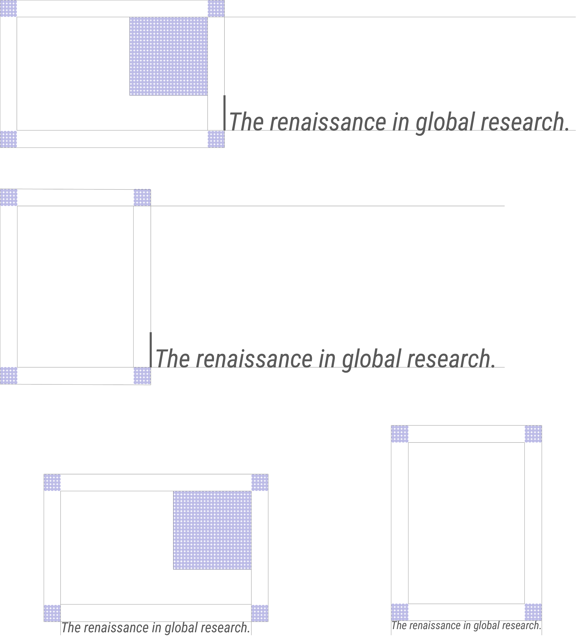
Our tagline serves as our rallying cry; a concise expression of our mission. It should appear only in key brand moments: presentations, advertisements, and the homepage, always positioned with intentionality.
When used alongside the logo, maintain the 5x clear space rule to preserve visual harmony. Its presence should feel deliberate, reinforcing our vision without overwhelming the core identity.

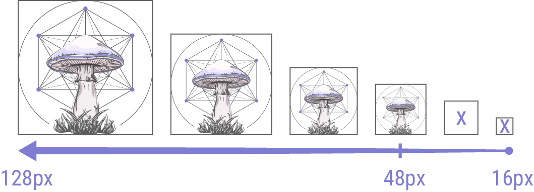
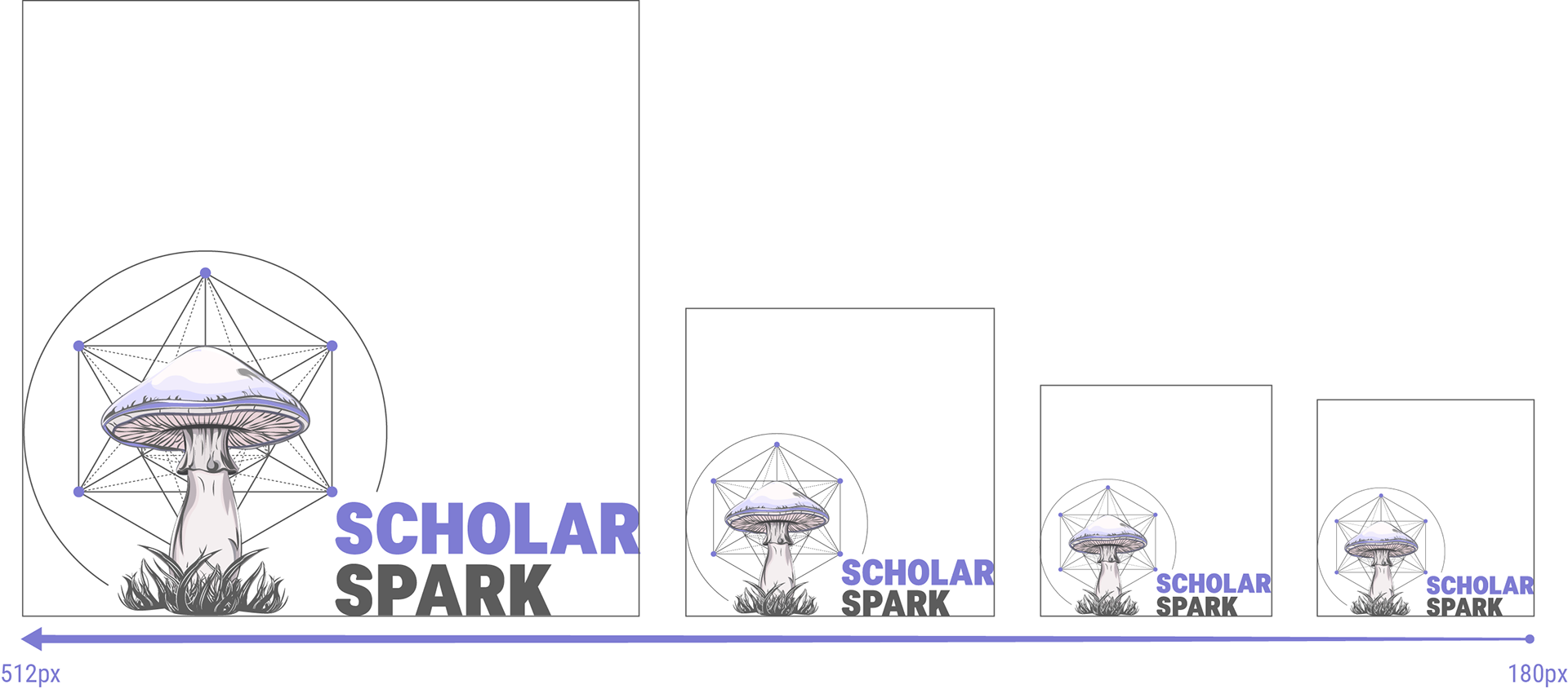
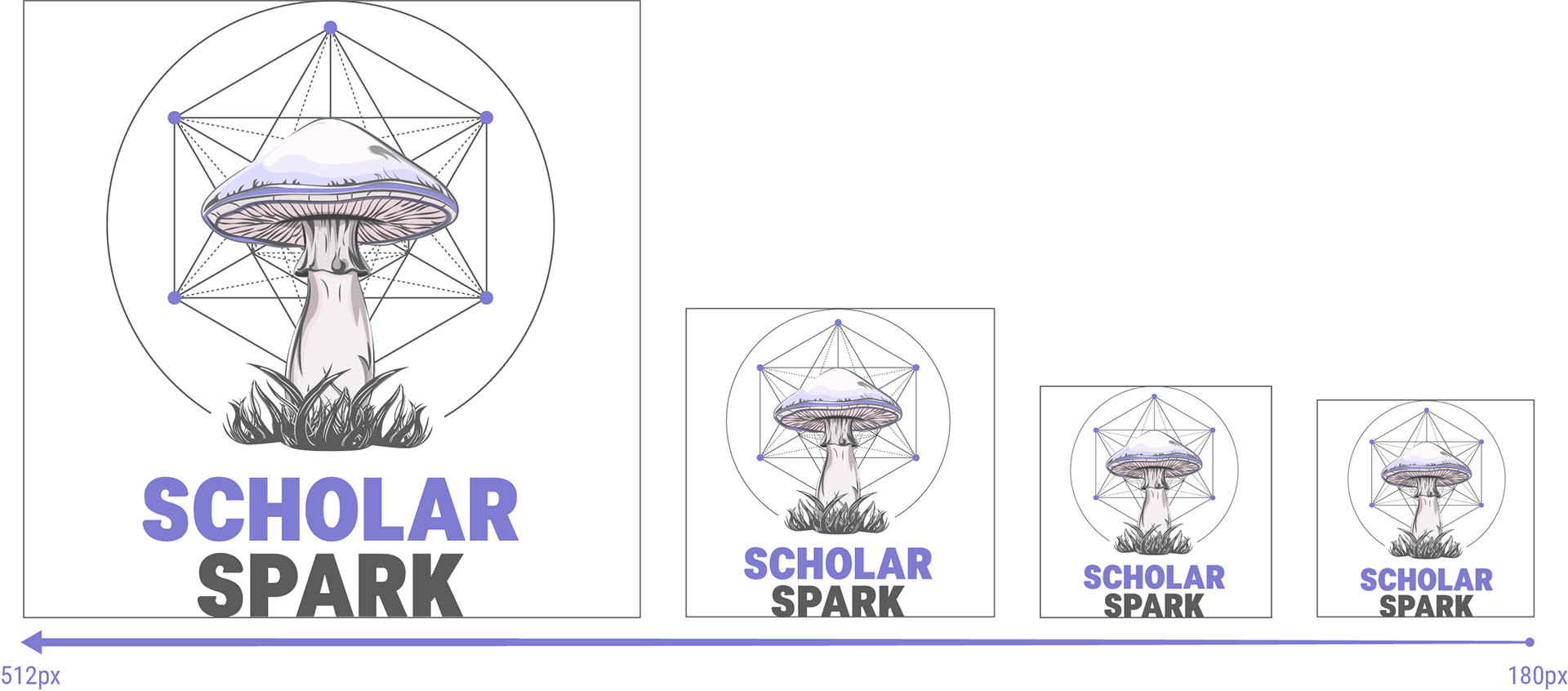
To maintain consistency and clarity across all applications, our logo has defined size parameters for different formats.
The standalone symbol serves as our favicon (48px–128px), while the horizontal (180px–512px) and vertical (96px–512px) versions ensure adaptability across digital and print media.
These guidelines preserve legibility, balance, and brand integrity at any scale.

- Dimensions: 32px – 128px (square)
Best for browser tabs, bookmarks, and app icons.

- Width range: 180px – 512px
Ideal for headers, footers, and digital ads.

- Height range: 96px – 512px
Perfect for social media, presentations, and print materials
These non-negotiables keep our brand sharp and cohesive.
• Never scale below minimum sizes: Preserve visibility and impact
• Always maintain proportions: No stretching, skewing, or distorting
• Use symbol-only for favicons: Ensures recognition at small scales
• Stick to predefined colors: Maintains visual consistency
• Respect clear space (5x rule): Protects logo integrity
• Deploy tagline strategically: Presentations, ads, and homepage only