

The Scholar Spark brand uses a carefully curated palette of five main colors and their variations across all platforms and communications.
Our color palette is a fundamental expression of the Scholar Spark identity, carefully selected to communicate our values of knowledge, creativity, and accessibility. The primary colors, Lavender (7E7DD4), Rose (E9D4D9), and Grey (5C5C5C), form the visual foundation for all brand communications, ensuring recognition and consistency across every touchpoint.
In addition to our primary and supporting colors, we utilize a specific palette for functional messaging within the interface. Green is reserved for success messages and positive confirmations, while yellow/orange indicates warnings. Red is used for critical situations, such as error messages, and blue conveys neutral informational messages. These colors ensure clear and immediate communication of system states to our users.
Complementing these, our dominant base colors, Neutral Black (#25252D), and Warm Neutral Grey (#F2F2F2), provide versatile foundations for both light and dark backgrounds, enhancing readability and visual harmony across all our digital and print materials.

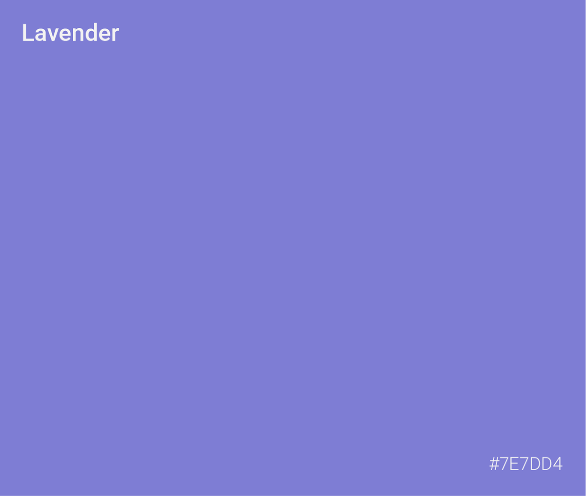
Represents intellectual curiosity and innovation, used for primary branding elements and key messaging.
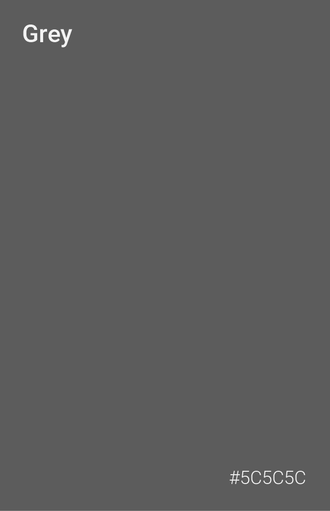
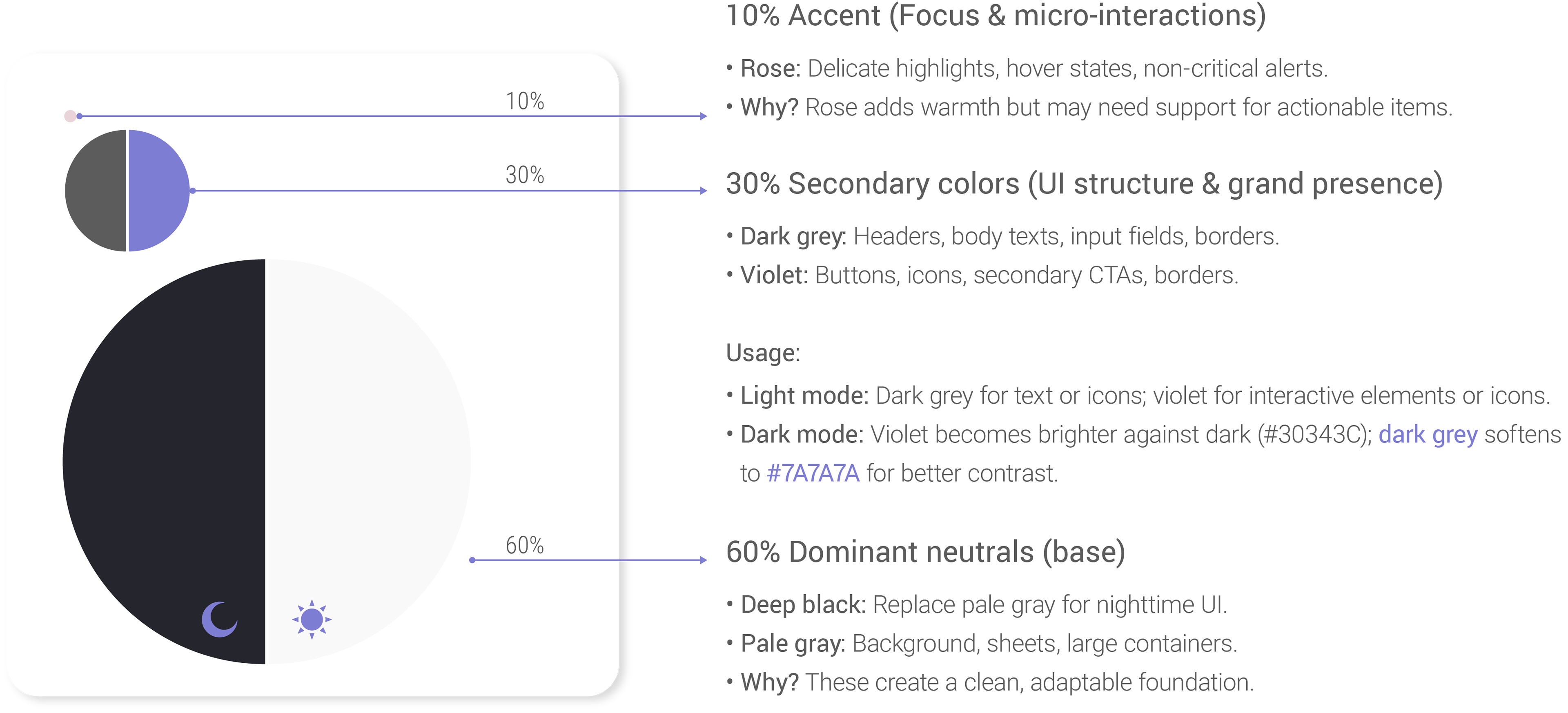
Provides structure and professionalism, serving as our primary neutral for text and functional elements.
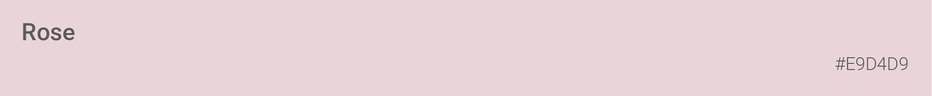
Conveys approachability and warmth, ideal for supporting elements and human-centered communications.
Dominant neutral, for backgrounds and subtitles.
Dominant neutral, for backgrounds and subtitles.

The 60-30-10 rule is a classic design principle used to create balanced and visually appealing color schemes, especially in applications, websites, and graphics. It helps distribute colors in a harmonious way while maintaining hierarchy and focus.

1. Accessibility Fixes
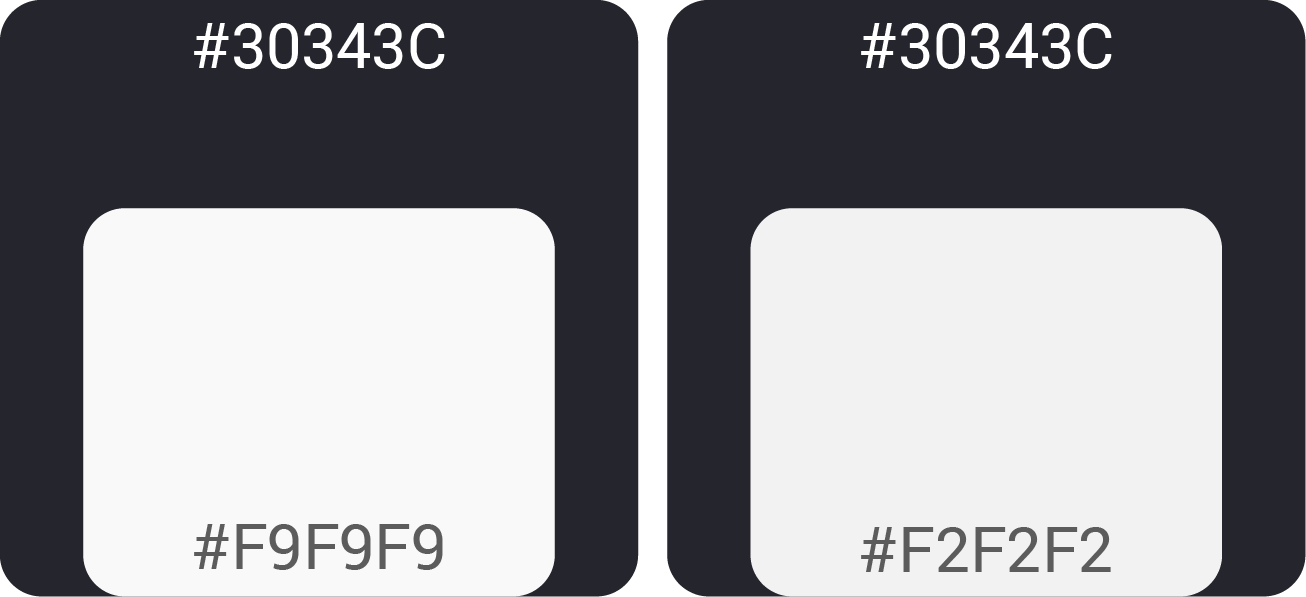
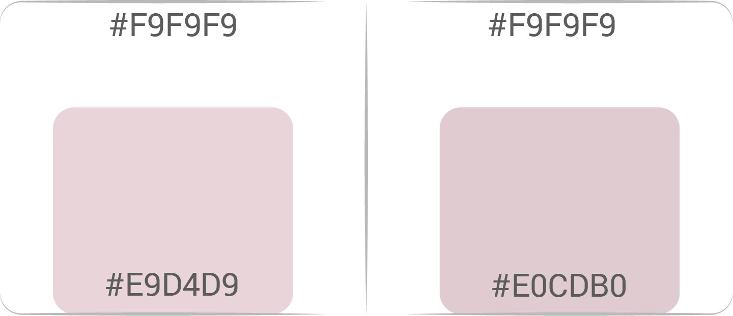
• Rose #E9D4D9 on Pale Gray #F9F9F9: Fails contrast (2:1 ratio).
Solution: Darken rose to #E0CDB0 or pair with dark gray (#5C5C5C) text/borders.
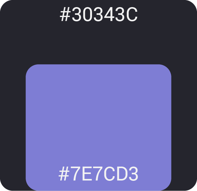
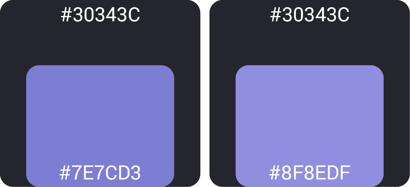
• Violet #7E7CD3 on Dark #30343C: Passes (4.5:1), but test for vibrancy.
2. Dark Mode Tweaks
• Reduce the violet saturation slightly (#8F8EDF) for better readability on dark.
• Increase the pale-gray saturation slightly (#F2F2F2) for better readability on any dark BG.