

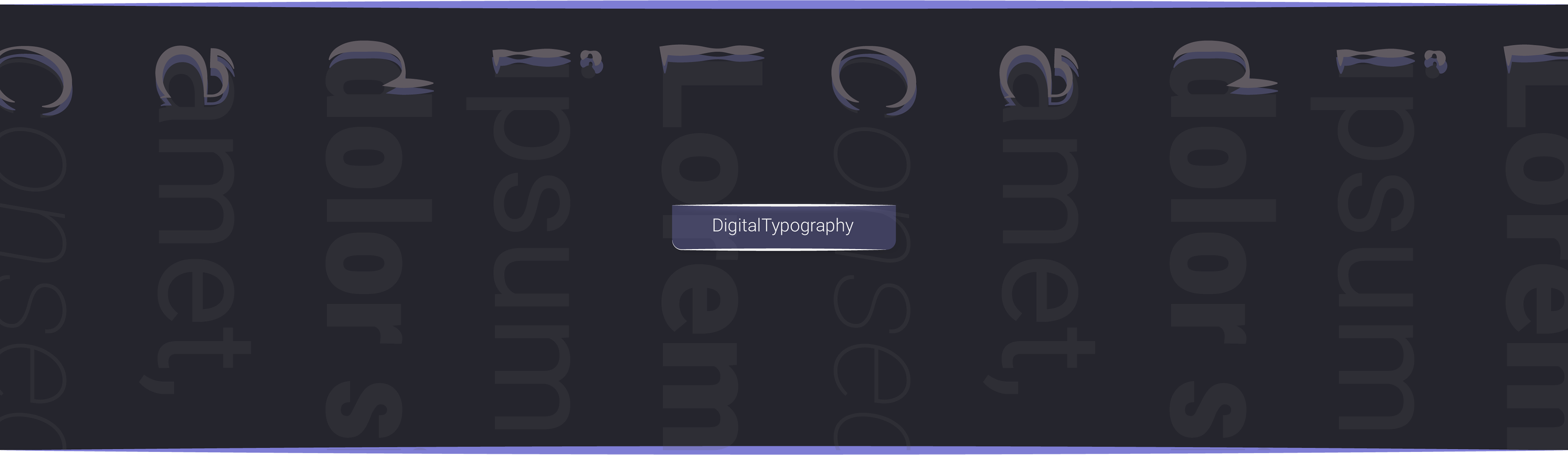
Scholar Spark Typography System
Scholar Spark's digital platform employs an intentional dual-font approach that balances aesthetics with functionality. Sans-serif typefaces command attention in headings, navigation elements, and interactive components, delivering a contemporary visual presence. For extended reading sections, carefully selected serif fonts enhance content comprehension through improved character distinction and reduced eye strain. This complementary system ensures consistent brand expression while adapting seamlessly across diverse devices and screen resolutions.
Typography forms the foundation of Scholar Spark's user experience design, strategically guiding users through digital content. This thoughtfully implemented system establishes clear information hierarchy, reinforces brand identity, and accommodates diverse accessibility needs. By prioritizing universal compatibility over custom font dependencies, Scholar Spark's typography creates a reliable and cohesive experience that maintains its integrity regardless of the user's technical environment or platform constraints.

• Hierarchy With Headers
Sans-serif, bold, typefaces for headers maximize legibility at larger sizes while maintaining a clean, modern aesthetic.

• Comfortable Reading Experience
Serif fonts for body text (long-form text) enhance readability and reduce eye strain.

• Harmonious Scaling
Our typographic system is built on proportional relationships using the Major Third ratio (1.25). This ratio governs not only font sizes but also the spacing around text elements, creating a harmonious visual rhythm throughout our designs.
As specified, the Major Third typographic scale with a base size of 16px creates the following progression:
-H3: 12.8 : 1.25 = 10.24px
-H4: 16px : 1.25 = 12.8px
Base: 16px
H4: 1.25 × 16px = 20px
H3: 1.25 × 20px = 25px
H2: 1.25 × 25px = ~31px
H1: 1.25 × 31px = ~39px
The Major Third scale maintains visual harmony between headers and body text while creating clear hierarchical relationships. Designers can implement this progression to ensure balanced typography across digital interfaces.
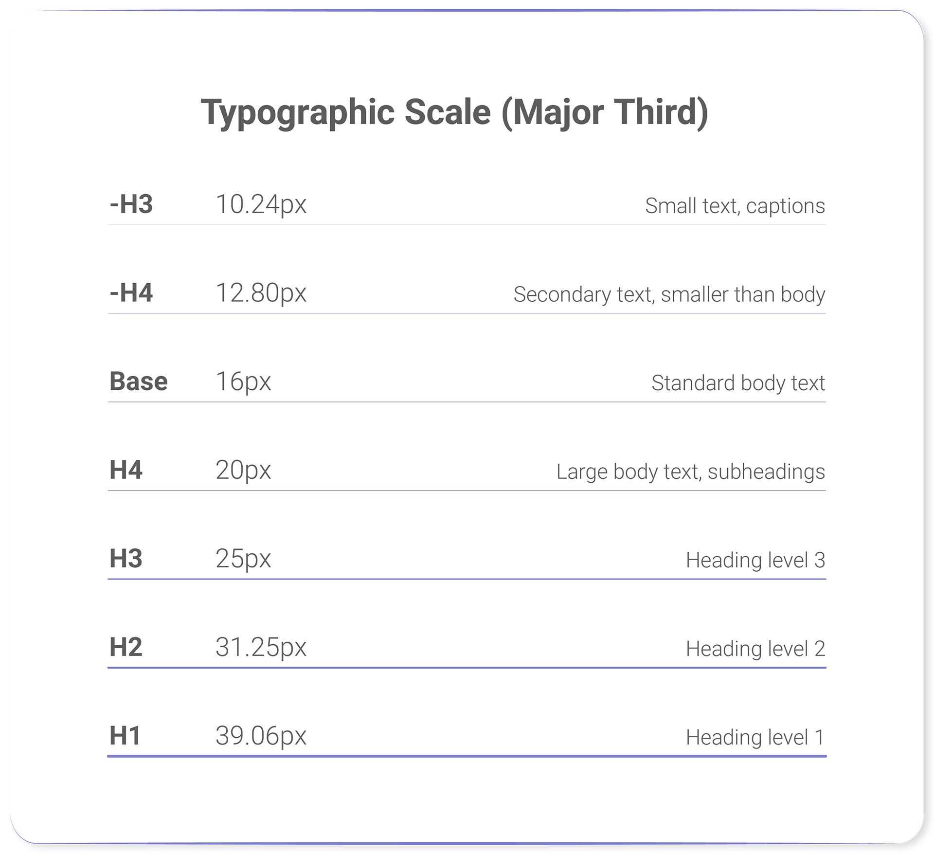
Key benefits include consistent vertical rhythm and mathematically proportional type relationships that enhance readability and aesthetic cohesion.

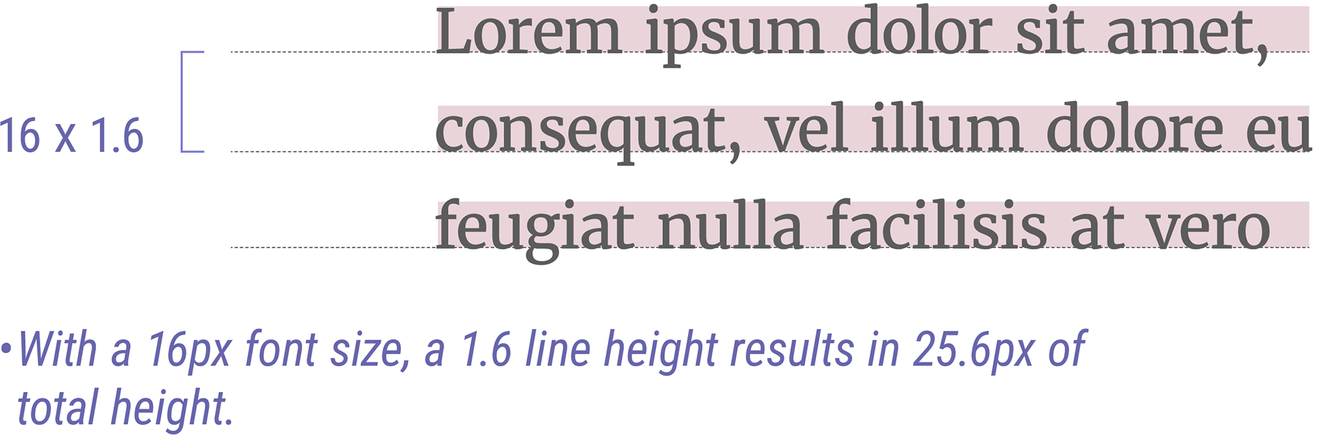
• Line Height
- For Long Texts (1.5 to 1.6 Line Height)
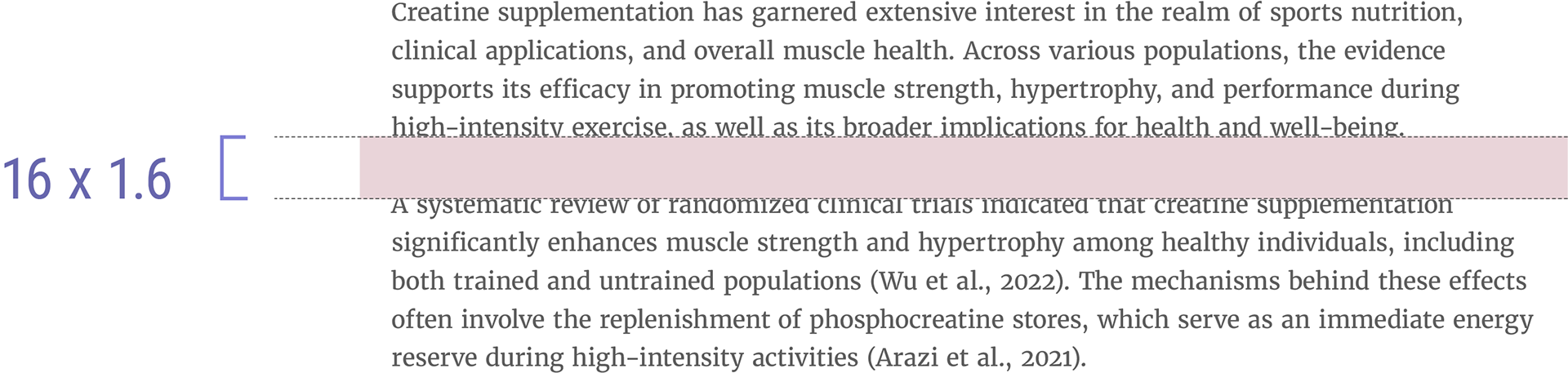
The human brain needs sufficient vertical space between lines to easily track the start of the next line while reading. This is why the WCAG (Web Content Accessibility Guidelines) recommends a minimum line-height of 1.5 for accessibility.
Our typography will use a line-height of 1.6, as readability research has demonstrated this value works effectively across most fonts and reading contexts. This unitless value falls within the recommended range for optimal legibility and scales naturally with font size changes. The 1.6 line-height is particularly well-suited for desktop reading experiences.
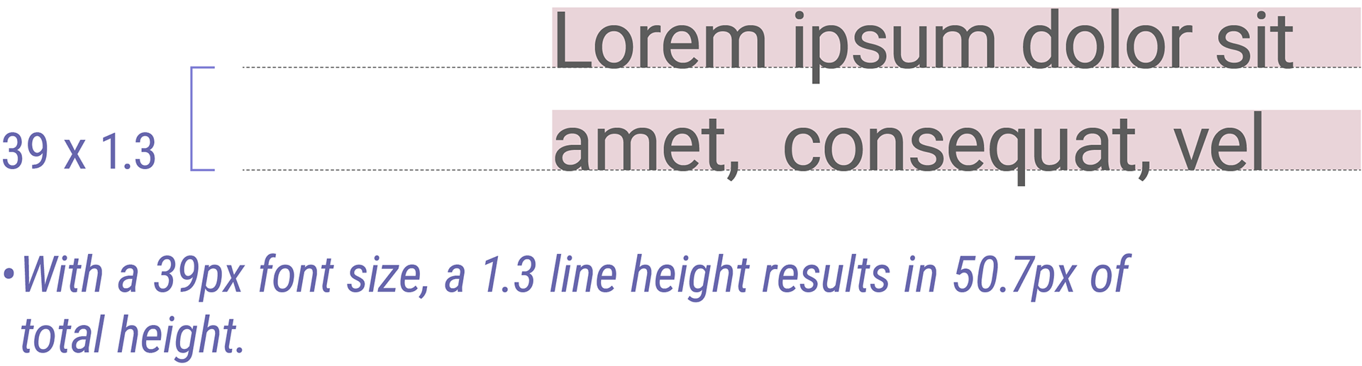
- For Headers (1.2 to 1.3 Line Height)
Headers utilize a tighter line-height of 1.2 to create visual hierarchy and maintain readability across multi-line headings.
Headers utilize a tighter line-height of 1.2 to create visual hierarchy and maintain readability across multi-line headings.
Our typography will use a line-height of 1.3, as his reduced spacing prevents headers from appearing too spread out while ensuring they remain distinct from body text, as established typography guidelines recommend tighter line-height for shorter content that doesn't require the additional vertical space needed for extended reading.

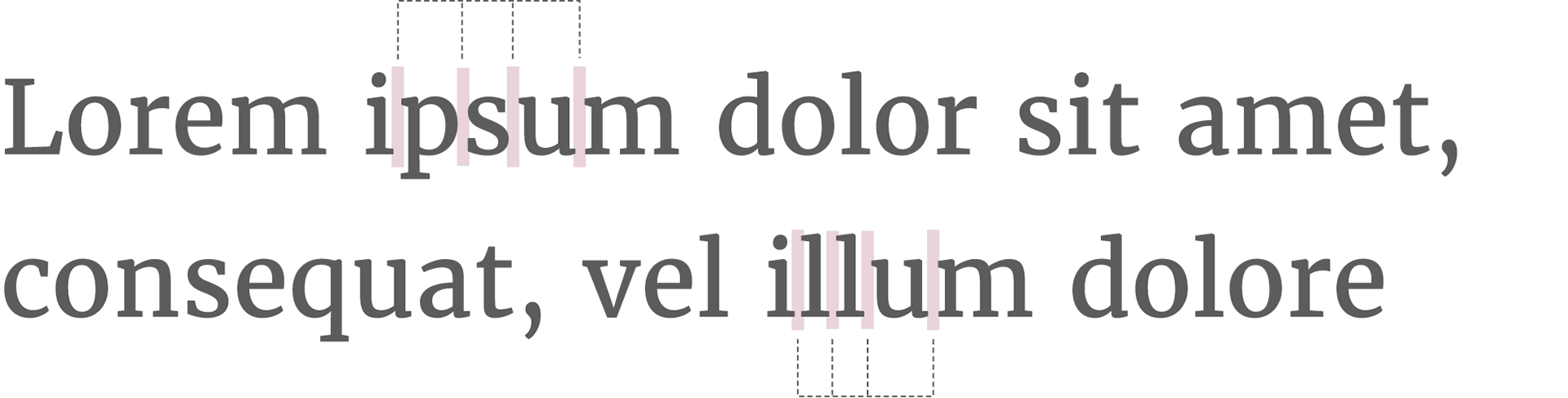
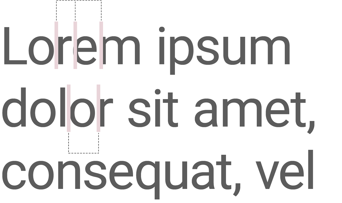
• Letter Spacing
Body text should maintain neutral letter spacing (0px to 4px) to prevent eye strain during extended reading.
Headers benefit from slightly condensed letter spacing (-0.5px) to improve visual impact.

• Paragraph Spacing
For long-form text paragraphs (<p>), the ideal spacing is typically equal to or slightly less than the line height.
Reasoning:
- Provides adequate separation between paragraphs without disrupting reading flow.
- Maintains alignment with the typographic scale (since 1em equals the base unit).

• Header Spacing (Testing Options)
When establishing header margins, we have identified three systematic approaches to maintain visual hierarchy and consistency within our typography system. Each option follows a different design principle and should be tested to determine the best fit for our brand's visual language.
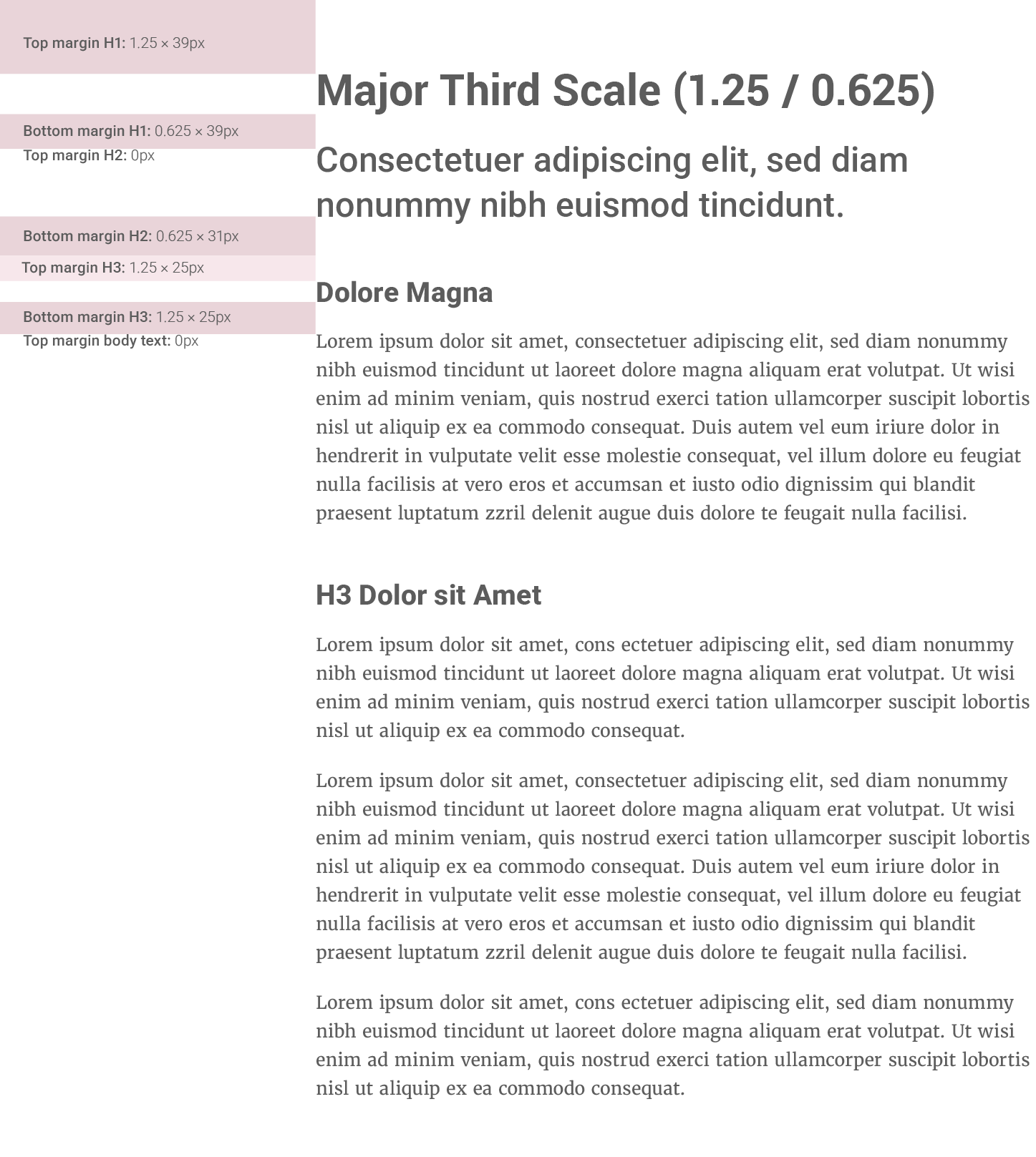
Option 1: Major Third Scale (1.25 / 0.625)
Following our chosen major third typography scale to maintain mathematical harmony throughout the system.
- Top margin: 1.25em (aligns with our 1.25 font scale ratio)
- Bottom margin: 0.625em (half of the scale ratio)
- Principle: Maintains proportional relationships consistent with our font sizing system
- Best for: Brands prioritizing systematic mathematical harmony in all design elements
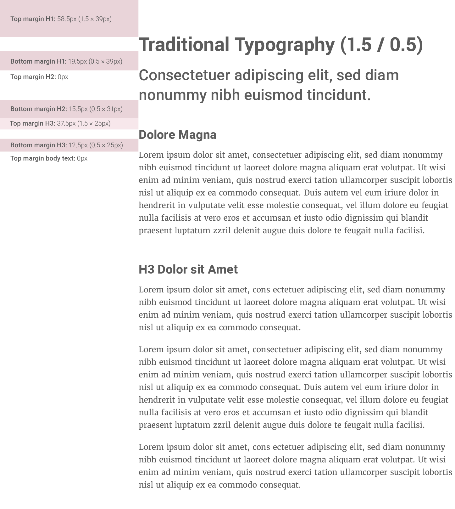
Option 2: Traditional Typography (1.5 / 0.5)
Using established typography conventions that balance separation and content association.
- Top margin: 1.5em (common industry standard for header separation)
- Bottom margin: 0.5em (minimal spacing to connect with following content)
- Principle: Time-tested approach balancing visual hierarchy with readability
- Best for: Brands seeking proven, conventional typography relationships
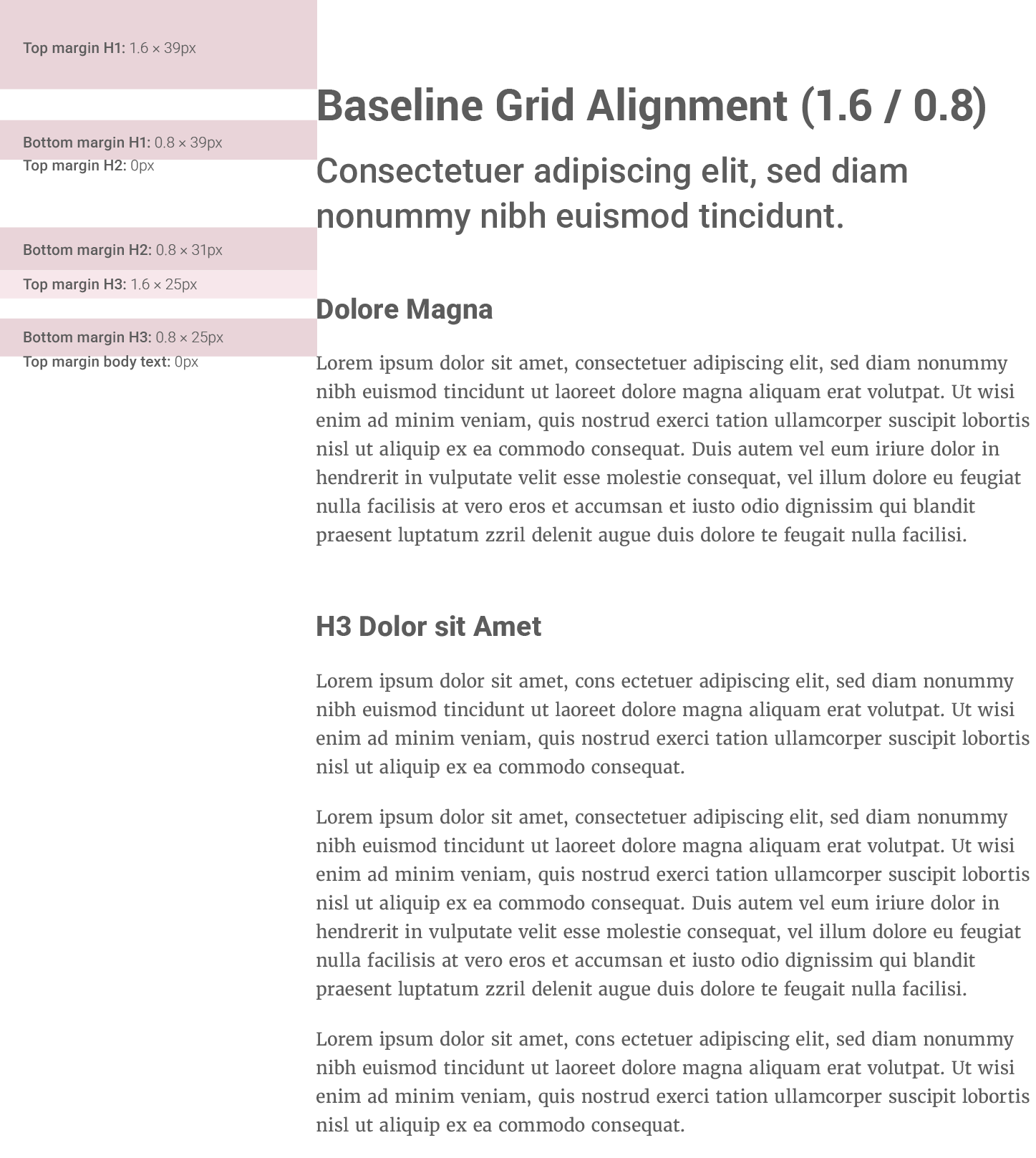
Option 3: Baseline Grid Alignment (1.6 / 0.8)
Aligning header margins with our baseline grid system using the same multiplier as our line-height.
- Top margin: 1.6em (matches our body text line-height for grid consistency)
- Bottom margin: 0.8em (half of the baseline grid unit)
- Principle: Creates unified vertical rhythm across all typography elements
- Best for: Brands prioritizing consistent baseline grid and unified spacing systems
Spacing Logic:
- Header margin-top: Larger space before higher-level headers (h1 > h4) to emphasize section breaks.
- Header margin-bottom: Consistent 0px or 1/2 (half the size of) to maintain connection with following content.
Testing Recommendation:
We recommend testing all three options across various content layouts to determine which approach best serves our brand's readability, visual hierarchy, and overall design coherence.

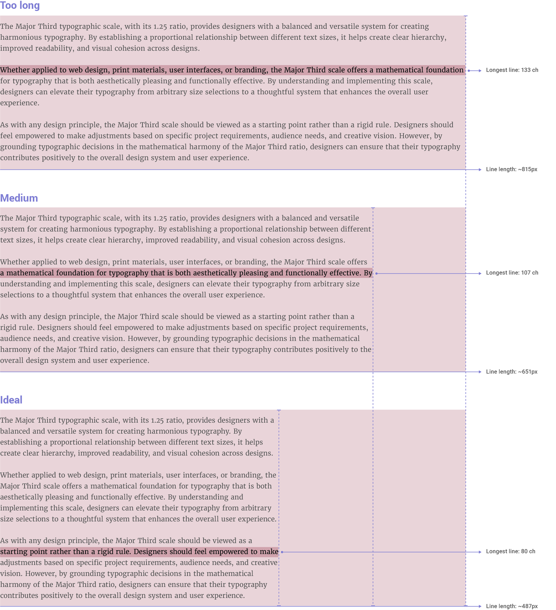
Line length (or measure in typography) is one of the most critical factors for ensuring readability and visual comfort in long-form text.
Why Control Line Length?
1. Eye strain: Excessively long lines force readers to scan back and forth, making it harder to find the next line.
2. Reading flow: Very short lines disrupt natural reading progression.
3. Accessibility: People with dyslexia or visual impairments are particularly affected by poorly sized lines.
• Bringhurst’s Rule.
In his classic The Elements of Typographic Style, Robert Bringhurst (a typography authority) proposes a simple rule:
• Guideline
For body text, aim for a line length that accommodates approximately 60-75 characters per line. This range has been shown to minimize eye strain and improve reading comprehension.
While a 480px width with 16px text may yield around 80 characters per line, we recommend a slightly narrower measure to align more closely with established typographic best practices for digital environments.
• Implementation
1. Always define the width of text containers using relative units (e.g., width: 100%;) and apply a max-width to prevent lines from becoming excessively long on larger screens.
2. Use Fluid Widths with max-width. For a base font size of 16px, a max-width of 37.5rem (equivalent to 600px, which at 16px font size would yield approximately 75 characters per line, assuming an average character width of 8px) is recommended.
This guideline for line length is informed by established typographic principles, including Robert Bringhurst’s insights on line length and modern web accessibility standards. It ensures a consistent and comfortable reading experience for all users, regardless of their device or screen size.